- Podcast Features
-
Monetization
-
Ads Marketplace
Join Ads Marketplace to earn through podcast sponsorships.
-
PodAds
Manage your ads with dynamic ad insertion capability.
-
Apple Podcasts Subscriptions Integration
Monetize with Apple Podcasts Subscriptions via Podbean.
-
Live Streaming
Earn rewards and recurring income from Fan Club membership.
-
Ads Marketplace
- Podbean App
-
Help and Support
-
Help Center
Get the answers and support you need.
-
Podbean Academy
Resources and guides to launch, grow, and monetize podcast.
-
Podbean Blog
Stay updated with the latest podcasting tips and trends.
-
What’s New
Check out our newest and recently released features!
-
Podcasting Smarter
Podcast interviews, best practices, and helpful tips.
-
Help Center
-
Popular Topics
-
How to Start a Podcast
The step-by-step guide to start your own podcast.
-
How to Start a Live Podcast
Create the best live podcast and engage your audience.
-
How to Monetize a Podcast
Tips on making the decision to monetize your podcast.
-
How to Promote Your Podcast
The best ways to get more eyes and ears on your podcast.
-
Podcast Advertising 101
Everything you need to know about podcast advertising.
-
Mobile Podcast Recording Guide
The ultimate guide to recording a podcast on your phone.
-
How to Use Group Recording
Steps to set up and use group recording in the Podbean app.
-
How to Start a Podcast
-
Podcasting
- Podcast Features
-
Monetization
-
Ads Marketplace
Join Ads Marketplace to earn through podcast sponsorships.
-
PodAds
Manage your ads with dynamic ad insertion capability.
-
Apple Podcasts Subscriptions Integration
Monetize with Apple Podcasts Subscriptions via Podbean.
-
Live Streaming
Earn rewards and recurring income from Fan Club membership.
-
Ads Marketplace
- Podbean App
- Advertisers
- Enterprise
- Pricing
-
Resources
-
Help and Support
-
Help Center
Get the answers and support you need.
-
Podbean Academy
Resources and guides to launch, grow, and monetize podcast.
-
Podbean Blog
Stay updated with the latest podcasting tips and trends.
-
What’s New
Check out our newest and recently released features!
-
Podcasting Smarter
Podcast interviews, best practices, and helpful tips.
-
Help Center
-
Popular Topics
-
How to Start a Podcast
The step-by-step guide to start your own podcast.
-
How to Start a Live Podcast
Create the best live podcast and engage your audience.
-
How to Monetize a Podcast
Tips on making the decision to monetize your podcast.
-
How to Promote Your Podcast
The best ways to get more eyes and ears on your podcast.
-
Podcast Advertising 101
Everything you need to know about podcast advertising.
-
Mobile Podcast Recording Guide
The ultimate guide to recording a podcast on your phone.
-
How to Use Group Recording
Steps to set up and use group recording in the Podbean app.
-
How to Start a Podcast
-
Help and Support
- Discover

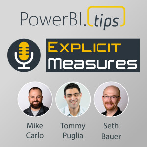
When we think of Data Visualization, we think of Data Analysis in Power BI. Is a Bar Chart Data Analytics though? What makes the jump from communicating with data to providing insights with data?
Get in touch:
Send in your questions or topics you want us to discuss by tweeting to @PowerBITips with the hashtag #empMailbag or submit on the PowerBI.tips Podcast Page.
Visit PowerBI.tips: https://powerbi.tips/
Watch the episodes live every Tuesday and Thursday morning at 730am CST on YouTube: https://www.youtube.com/powerbitips
Subscribe on Spotify: https://open.spotify.com/show/230fp78XmHHRXTiYICRLVv
Subscribe on Apple: https://podcasts.apple.com/us/podcast/explicit-measures-podcast/id1568944083
Check Out Community Jam: https://jam.powerbi.tips
Follow Mike: https://www.linkedin.com/in/michaelcarlo/
Follow Seth: https://www.linkedin.com/in/seth-bauer/
Follow Tommy: https://www.linkedin.com/in/tommypuglia/
More Episodes
 2025-02-12
 2025-02-11
 2025-01-21
 2025-01-16
 2025-01-14
 2025-01-09
 2025-01-02
 2024-12-26
 2024-12-24
Create your
podcast in
minutes
- Full-featured podcast site
- Unlimited storage and bandwidth
- Comprehensive podcast stats
- Distribute to Apple Podcasts, Spotify, and more
- Make money with your podcast
It is Free
- Privacy Policy
- Cookie Policy
- Terms of Use
- Consent Preferences
- Copyright © 2015-2025 Podbean.com


