- Podcast Features
-
Monetization
-
Ads Marketplace
Join Ads Marketplace to earn through podcast sponsorships.
-
PodAds
Manage your ads with dynamic ad insertion capability.
-
Apple Podcasts Subscriptions Integration
Monetize with Apple Podcasts Subscriptions via Podbean.
-
Live Streaming
Earn rewards and recurring income from Fan Club membership.
-
Ads Marketplace
- Podbean App
-
Help and Support
-
Help Center
Get the answers and support you need.
-
Podbean Academy
Resources and guides to launch, grow, and monetize podcast.
-
Podbean Blog
Stay updated with the latest podcasting tips and trends.
-
What’s New
Check out our newest and recently released features!
-
Podcasting Smarter
Podcast interviews, best practices, and helpful tips.
-
Help Center
-
Popular Topics
-
How to Start a Podcast
The step-by-step guide to start your own podcast.
-
How to Start a Live Podcast
Create the best live podcast and engage your audience.
-
How to Monetize a Podcast
Tips on making the decision to monetize your podcast.
-
How to Promote Your Podcast
The best ways to get more eyes and ears on your podcast.
-
Podcast Advertising 101
Everything you need to know about podcast advertising.
-
Mobile Podcast Recording Guide
The ultimate guide to recording a podcast on your phone.
-
How to Use Group Recording
Steps to set up and use group recording in the Podbean app.
-
How to Start a Podcast
-
Podcasting
- Podcast Features
-
Monetization
-
Ads Marketplace
Join Ads Marketplace to earn through podcast sponsorships.
-
PodAds
Manage your ads with dynamic ad insertion capability.
-
Apple Podcasts Subscriptions Integration
Monetize with Apple Podcasts Subscriptions via Podbean.
-
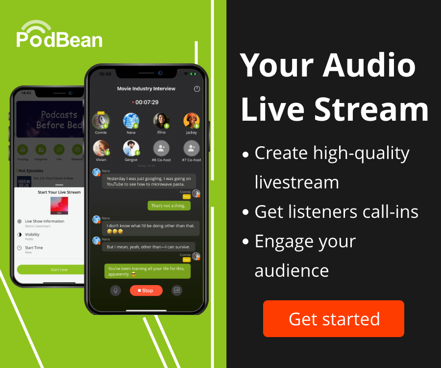
Live Streaming
Earn rewards and recurring income from Fan Club membership.
-
Ads Marketplace
- Podbean App
- Advertisers
- Enterprise
- Pricing
-
Resources
-
Help and Support
-
Help Center
Get the answers and support you need.
-
Podbean Academy
Resources and guides to launch, grow, and monetize podcast.
-
Podbean Blog
Stay updated with the latest podcasting tips and trends.
-
What’s New
Check out our newest and recently released features!
-
Podcasting Smarter
Podcast interviews, best practices, and helpful tips.
-
Help Center
-
Popular Topics
-
How to Start a Podcast
The step-by-step guide to start your own podcast.
-
How to Start a Live Podcast
Create the best live podcast and engage your audience.
-
How to Monetize a Podcast
Tips on making the decision to monetize your podcast.
-
How to Promote Your Podcast
The best ways to get more eyes and ears on your podcast.
-
Podcast Advertising 101
Everything you need to know about podcast advertising.
-
Mobile Podcast Recording Guide
The ultimate guide to recording a podcast on your phone.
-
How to Use Group Recording
Steps to set up and use group recording in the Podbean app.
-
How to Start a Podcast
-
Help and Support
- Discover

Event: Crushed for Wedding Pros
Business:Entrepreneurship

Ep. 23: Optimizing Your Website for Sales Success with Hannah of Made with Boldness
- Showit can be a better fit for wedding pros than other platforms.
- Blogging is an underutilized tool for wedding professionals.
- Websites need to have clear calls to action.
- Clear navigation is crucial for user experience.
- Avoid overwhelming visitors with too many photos.
- Fonts should be readable for accessibility (16 px minimum).
- Pricing (at least starting prices or a range) should be visible on websites.
- If it's been 4-5 years, you no longer like your branding, or it's not working for you anymore -- it's time for a rebrand!
- Share your website with friends outside the industry for neutral feedback.
Episodes mentioned in this podcast:
- Episode 21: Demystifying SEO for Wedding Pros with Adrienna of Ava & The Bee
- Hannah's website, Made with Boldness
- Hannah's free website checklist mentioned in the episode
- Hannah's Newsletter signup
- Made with Boldness on Instagram
Event Crush on Instagram | becky@eventcrush.com | www.eventcrush.com
See you back here next week!
More Episodes
Create your
podcast in
minutes
- Full-featured podcast site
- Unlimited storage and bandwidth
- Comprehensive podcast stats
- Distribute to Apple Podcasts, Spotify, and more
- Make money with your podcast
It is Free
- Privacy Policy
- Cookie Policy
- Terms of Use
- Consent Preferences
- Copyright © 2015-2025 Podbean.com


